
Introduction:
🔍 What does a data scientist actually do?
💡 Why are they among the highest-paid professionals today?
📊 How can YOU become one?
In this comprehensive guide, we’ll break down:
✅ What a data scientist does
✅ Key skills & qualifications needed
✅ Step-by-step career path
✅ Real-world applications & salary insights
✅ Diagrams, infographics, and expert tips
A futuristic data scientist analyzing complex dashboards.

What is a Data Scientist?
A data scientist is a big data wrangler—someone who collects, processes, and analyzes structured & unstructured data to extract meaningful insights.
Key Responsibilities
Task Description Tools Used
Data Collection Gather data from APIs, web scraping, surveys Python, SQL, Scrapy
Data Cleaning Remove noise, handle missing values Pandas, OpenRefine
Exploratory Analysis Find trends & patterns Matplotlib, Seaborn
Machine Learning Build predictive models Scikit-learn, TensorFlow
Data Storytelling Present insights visually Tableau, Power BI
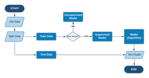
📌 Example Workflow:
flowchart: Raw Data → Cleaning → Analysis → ML Model → Business Decision
Watch on YouTube
Why Become a Data Scientist?
1. High Demand & Salary
💰 Average Salary (2024):
• Entry-Level: $90,000 – $120,000
• Senior-Level: $150,000 – $200,000+
📈 Job Growth:
• 35% increase (2020-2030, U.S. Bureau of Labor Statistics)
(Include a bar chart comparing data science salaries vs. other tech roles.)
2. Cross-Industry Applications
🌍 Industries Hiring Data Scientists:
✔ Tech (Google, Meta, Amazon)
✔ Finance (Fraud detection, risk modeling)
✔ Healthcare (Drug discovery, patient analytics)
✔ Retail (Customer segmentation, demand forecasting)
How to Become a Data Scientist (6 Steps)
1️⃣ Earn a Bachelor’s Degree
📚 Recommended Majors:
• Computer Science
• Statistics / Mathematics
• Engineering
• Economics (Quantitative Focus)
🎓 Pro Tip:
“A strong foundation in linear algebra & calculus is crucial for ML algorithms.”
2️⃣ Master Key Skills
🛠️ Technical Skills:
✔ Programming (Python, R, SQL)
✔ Machine Learning (Supervised/Unsupervised Learning)
✔ Big Data Tools (Hadoop, Spark)
✔ Data Visualization (Tableau, Power BI)
💡 Soft Skills:
✔ Problem-Solving
✔ Business Acumen
✔ Storytelling with Data
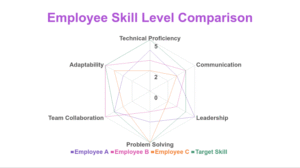
a radar chart comparing technical vs. soft skills
3️⃣ Specialize (Optional but Recommended)
🎯 Top Specializations:
• AI/Deep Learning
• Business Analytics
• Natural Language Processing (NLP)
• Computer Vision
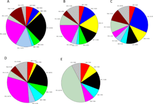
a pie chart showing demand for specializations
4️⃣ Build a Portfolio
📂 Project Ideas:
• Predictive Model for Stock Prices
• Customer Churn Analysis
• Social Media Sentiment Analysis
🔗 Where to Host?
• GitHub (Code)
• Kaggle (Datasets & Competitions)
• Personal Blog (Case Studies)
5️⃣ Get Certified (Boost Your Resume)
🏅 Top Certifications:
Certification Issuer
Google Data Analytics Coursera
IBM Data Science IBM
Microsoft Certified: Azure Data Scientist Microsoft
TensorFlow Developer Certificate
a comparison table of certifications

6️⃣ Land Your First Job
🔍 Job Titles to Look For:
• Junior Data Scientist
• Data Analyst
• Business Intelligence Analyst
📌 Pro Tip:
“Networking & LinkedIn outreach can fast-track your job search!”
Data Scientist vs. Related Roles
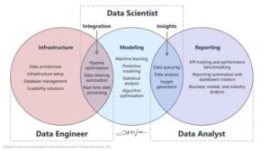
a Venn diagram comparing Data Scientist, Data Analyst, and ML Engineer
Role Focus Tools Avg. Salary
Data Scientist ML, Advanced Stats Python, R, SQL $120K+
Data Analyst Reporting, Dashboards Excel, Tableau $70K-$90K
ML Engineer Deploying AI Models TensorFlow, PyTorch $130K+
Real-World Applications
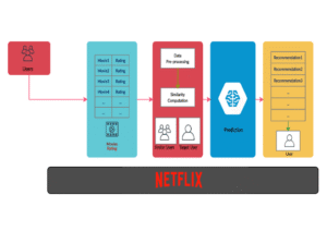
Case Study 1: Netflix Recommendation Engine
🎬 How It Works:
• Uses collaborative filtering to suggest shows.
• Saves $1B/year by reducing churn.
a simplified diagram of Netflix’s recommendation system
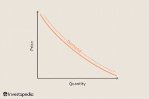
Case Study 2: Uber’s Dynamic Pricing
🚗 Data Science in Action:
• Predicts demand surges using ML.
• Adjusts prices in real-time.
a line graph showing price vs. demand
Is Data Science Right for You?
✅ Choose Data Science If You:
✔ Love solving puzzles with data
✔ Enjoy coding & statistics
✔ Want a high-growth, high-paying career
❌ Avoid If You:
✖ Dislike math/programming
✖ Prefer non-technical roles
Final Thoughts
Data science is one of the most exciting careers of the 21st century. With the right skills, you can unlock endless opportunities in tech, finance, healthcare, and beyond.
Did you find this guide helpful?
🔹 Comment Below: “Which step are you on in your data science journey?”
🔹 Feel free Like & Share this article!