
Introduction
Data visualization is the graphical representation of information and data. By using visual elements like charts, graphs, and maps, data visualization tools provide an accessible way to see and understand trends, outliers, and patterns in data.
In today’s data-driven world, effective visualization is crucial for making informed decisions, whether in business, science, healthcare, or everyday life.
This article explores:
– The importance of data visualization
– Common types of data visualizations
– Best practices for effective visualization
– Tools and technologies used in data visualization
Why is Data Visualization Important?
Humans process visual information much faster than text or numbers. Studies show that the brain interprets visuals **60,000 times faster** than text. Here’s why data visualization matters:
1. Simplifies Complex Data: – Large datasets become easier to digest when represented visually.
2. Reveals Patterns & Trends: – Helps identify correlations and anomalies that may go unnoticed in raw data.
3. Enhances Decision-Making: Businesses and researchers rely on visuals for strategic insights.
4. Improves Communication: Visuals make data storytelling more compelling and persuasive.
Example:
A sales team can use a **line chart** to track monthly revenue growth instead of analyzing spreadsheets.
A comparative image between raw data table vs. a visualized line chart showing sales trends
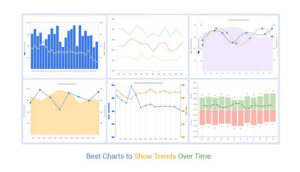
Common Types of Data Visualizations:
Different data types require different visualization techniques. Below are some widely used formats:
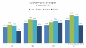
1. Bar Charts:
– Best for comparing quantities across categories.
– Example: Comparing sales performance across regions.
a bar chart showing sales by region:
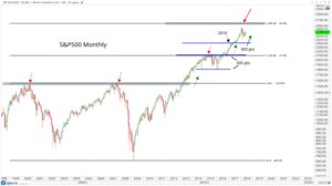
2. Line Graphs:
– Ideal for tracking changes over time.
– Example: Stock market trends over a year.
A line graph depicting stock price fluctuations:
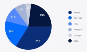
3. Pie Charts
– Shows parts of a whole (percentage distribution).
– Example: Market share of different smartphone brands.
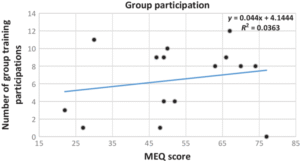
4. Scatter Plots:
– Displays relationships between two variables.
– Example: Correlation between study hours and exam scores.
5. Heatmaps
– Represents data density using color gradients.
– Example: Website click-through rates across different pages.

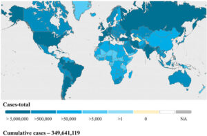
6. Geographic Maps
– Visualizes location-based data.
– Example: COVID-19 cases by country.
Best Practices for Effective Data Visualization
Not all visuals are equally effective. Follow these principles for clarity and impact:
✅ **Choose the Right Chart** – Match the visualization to your data type.
✅ **Keep It Simple** – Avoid clutter; focus on key insights.
✅ **Use Color Wisely** – Highlight important data points without overwhelming the viewer.
✅ **Label Clearly** – Ensure axes, legends, and titles are descriptive.
✅ **Tell a Story** – Guide the viewer through the data narrative.
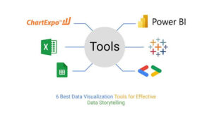
## **Popular Data Visualization Tools**
Several tools help create stunning visuals:
| **Tool** | **Best For** | **Example Use Case** |
|——————|———————————-|——————————-|
| **Tableau** | Interactive dashboards | Business analytics |
| **Power BI** | Microsoft ecosystem integration | Financial reporting |
| **Python (Matplotlib/Seaborn)** | Custom scientific visuals | Machine learning analysis |
| **Google Data Studio** | Free & collaborative reports | Marketing performance tracking|
| **D3.js** | Web-based dynamic visualizations | Custom interactive charts |
Conclusion
Data visualization transforms raw data into meaningful insights, enabling better understanding and decision-making. Whether you’re a data scientist, business analyst, or student, mastering visualization techniques is essential in today’s information-rich world.